Camolese
Branding, Content, Digital, Identity, Strategy
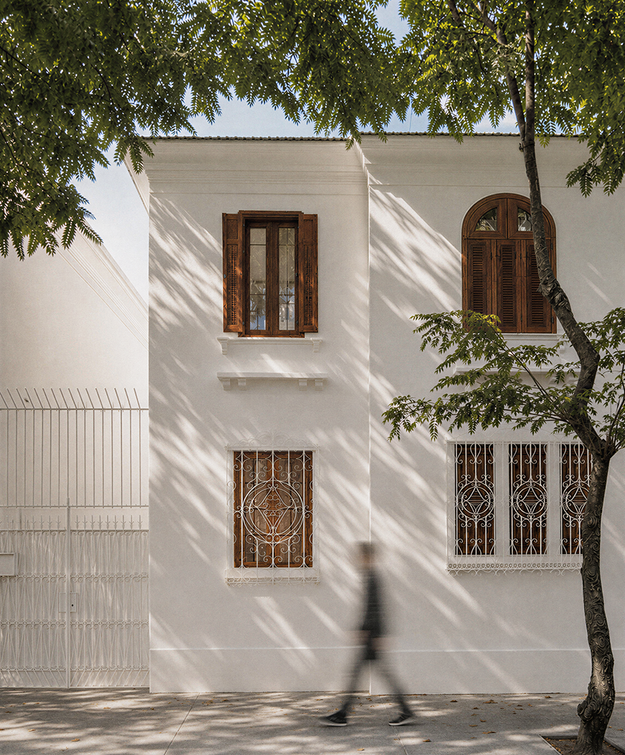
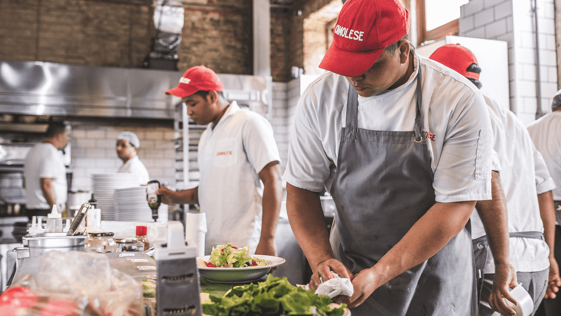
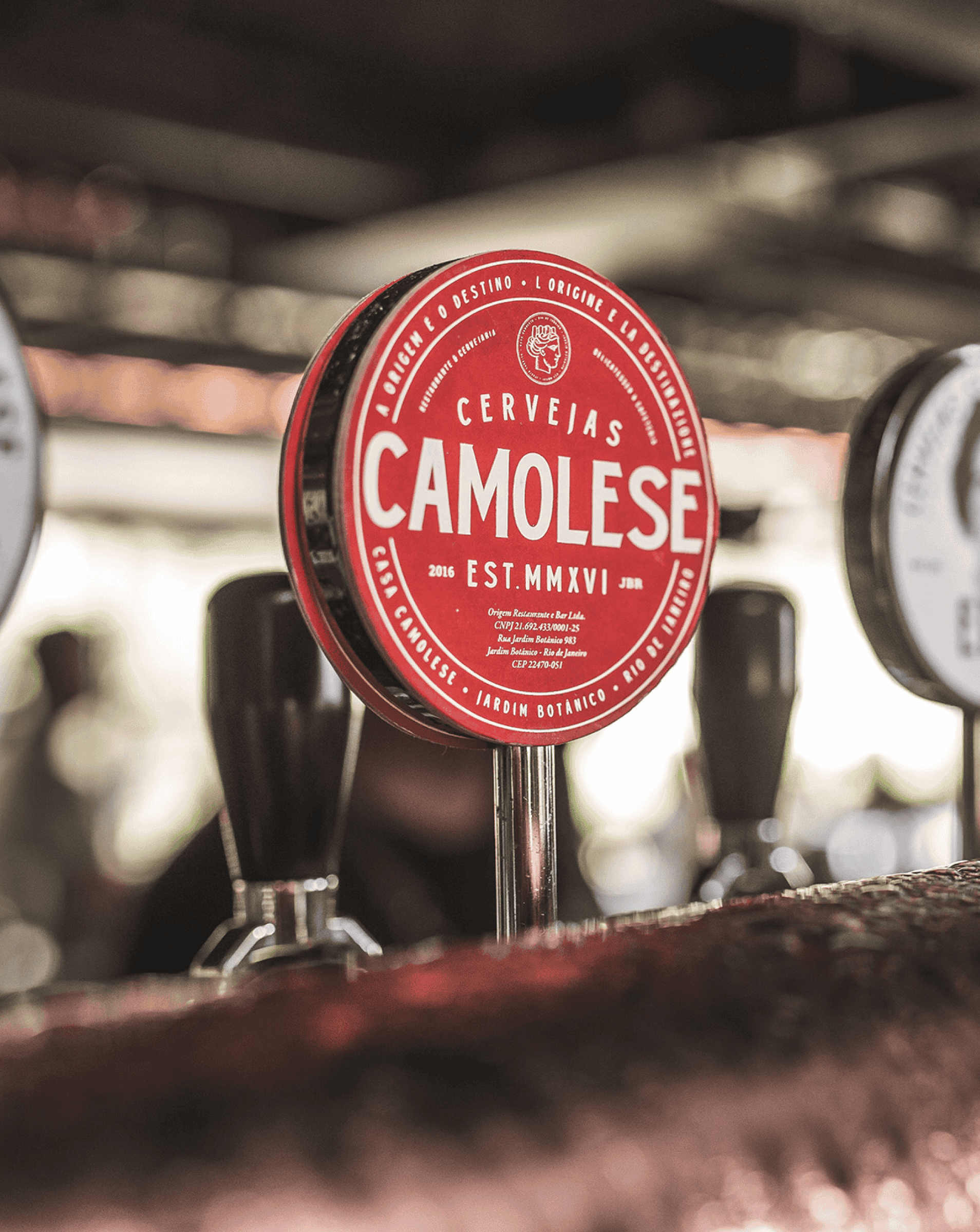
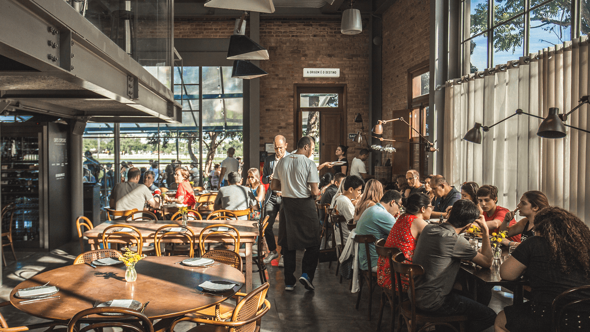
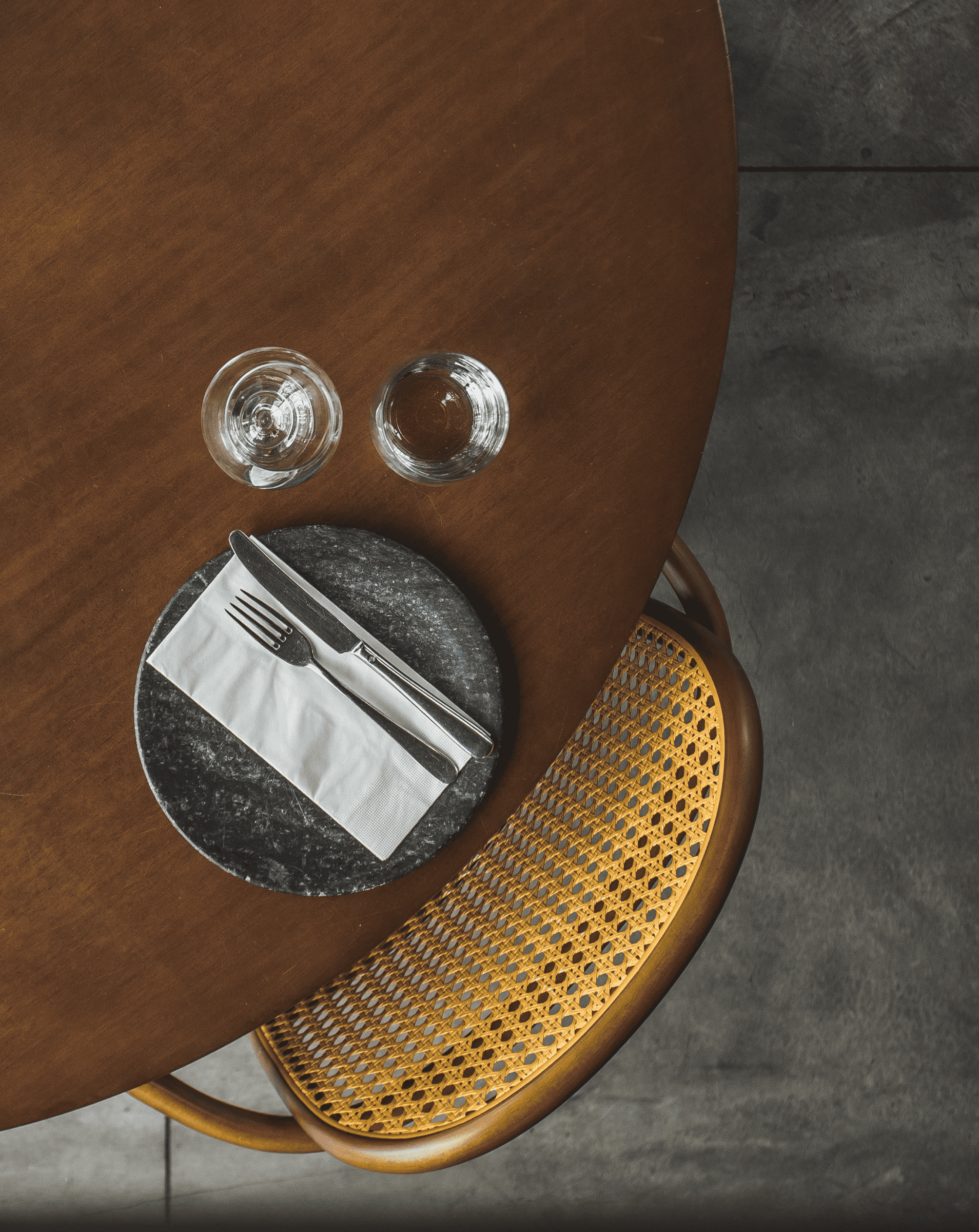
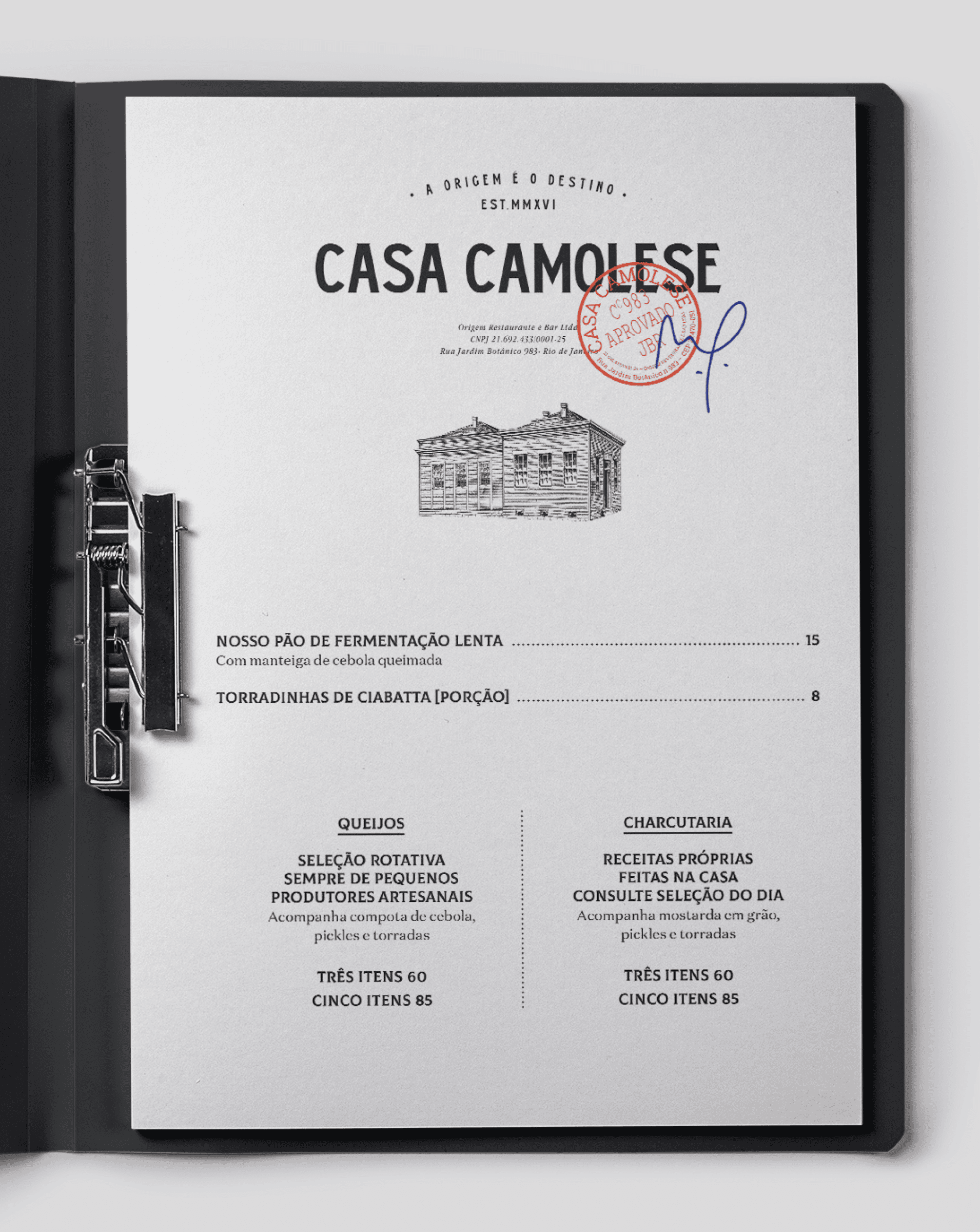
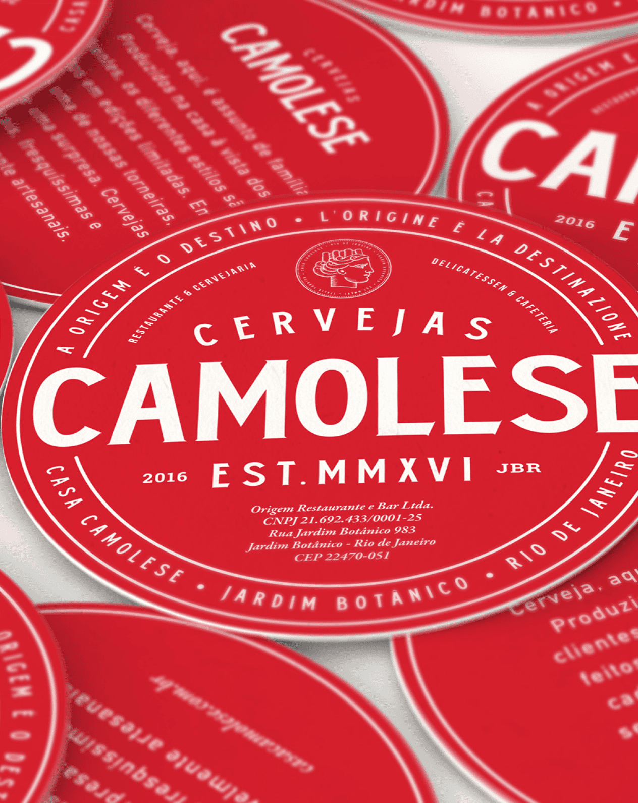
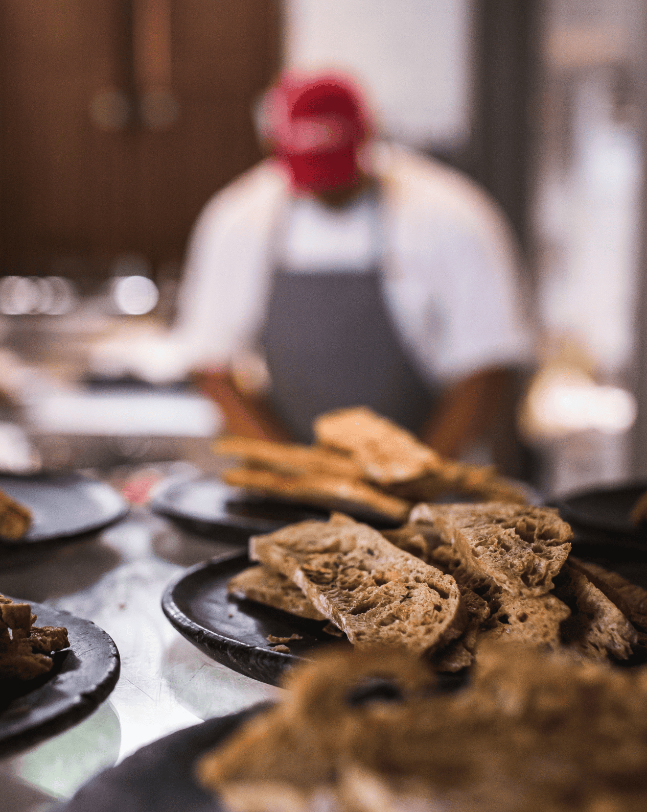
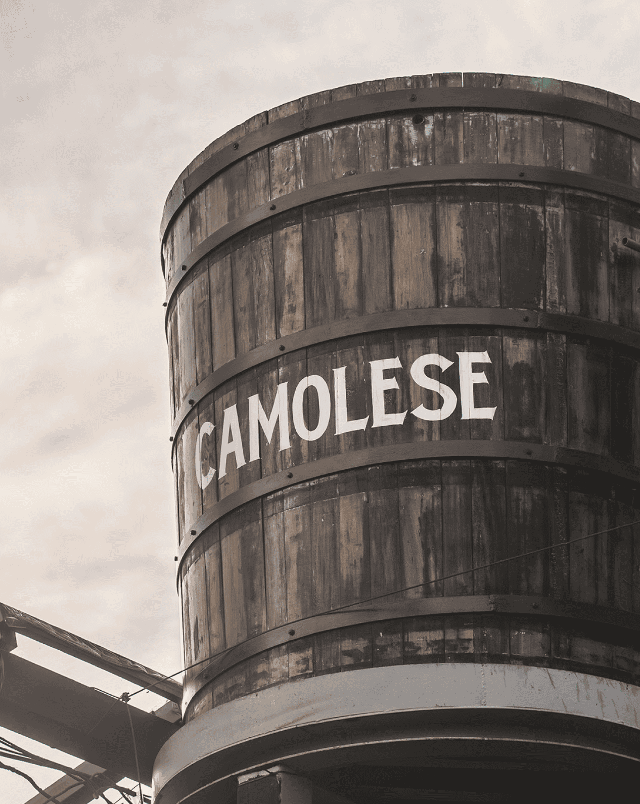
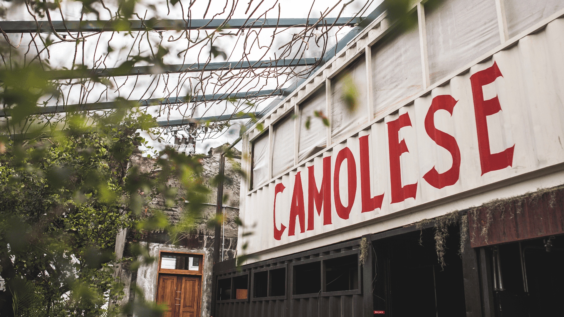
Casa Camolese brings together different ways of experiencing the city at a single address. Behind a heritage-listed façade, a restaurant, craft brewery, high-end cocktail bar, delicatessen, and music program coexist. We worked with Casa Camolese from the very beginning, when there was nothing but the site. Over four years, we were involved in building the entire brand experience: from branding and visual identity to plates, glasses, uniforms, stationery, and the space’s communication. The identity combines the house’s Rio atmosphere with the imagery of vintage Italian beverage labels, vermouths, aperitifs, and classic bars, where design—like the drinks themselves—carries a whole tradition. The result is a distinctive, balanced language: a system inspired by the Italian graphic tradition but created for an essentially Rio setting.
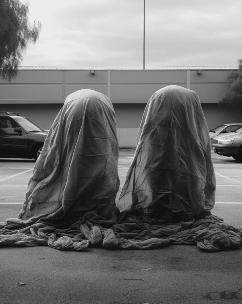
Simplexidade helps organizations operate in complex contexts without confusing complexity with complication. We applied this approach to the visual identity through graphics that explore the organic–digital duality and build on the idea of the power of relationships when integrated.
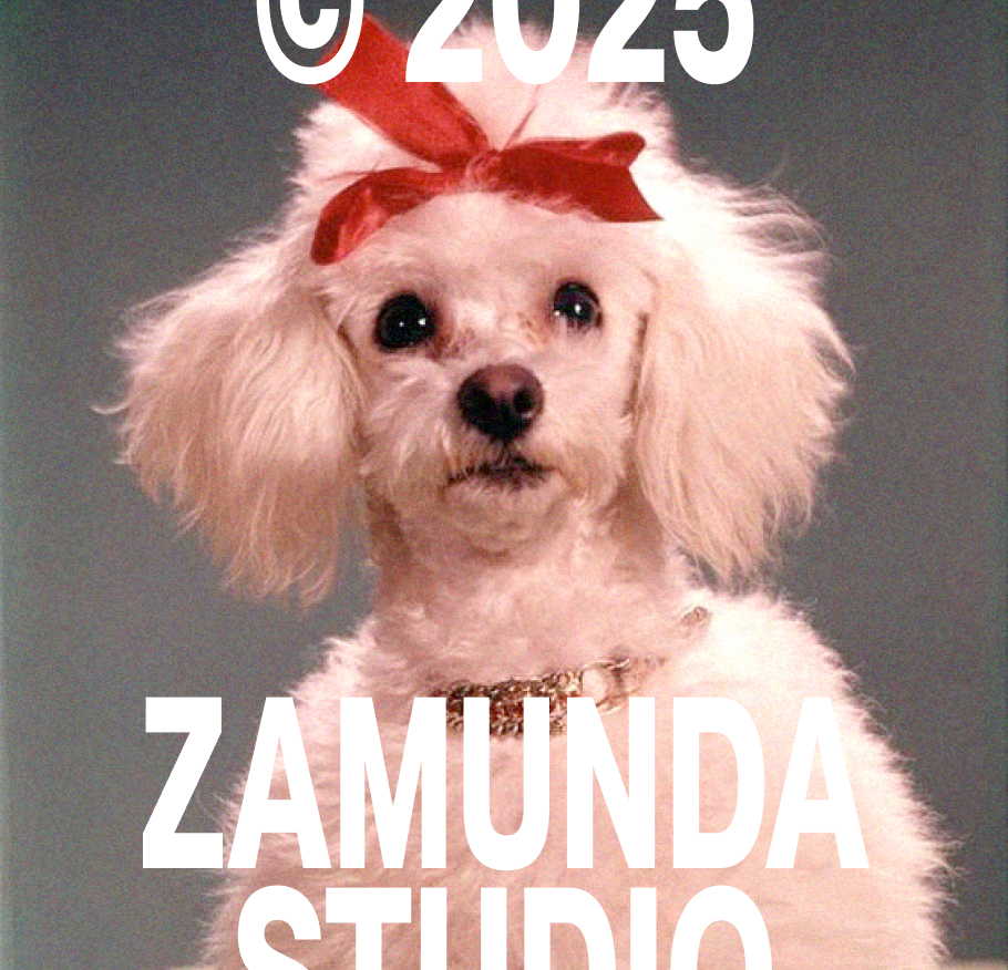
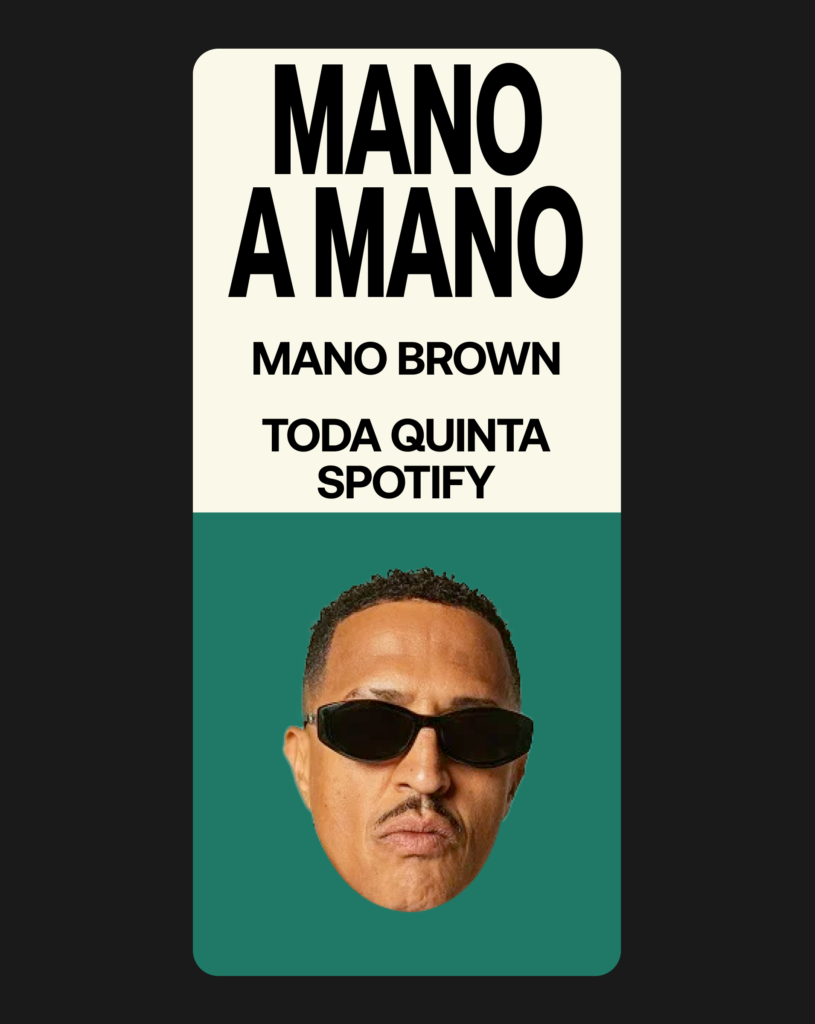

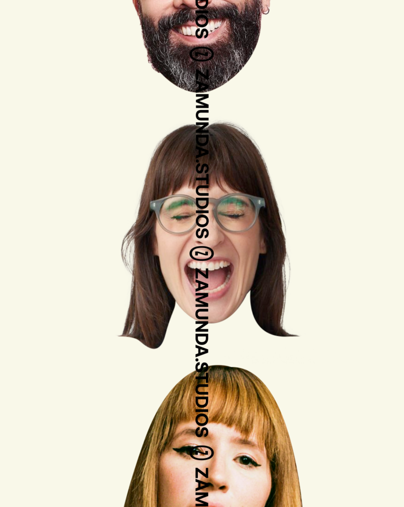

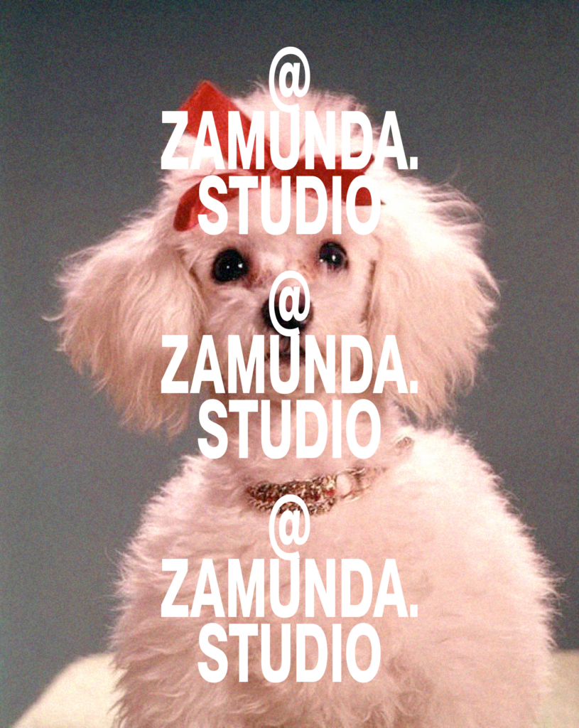
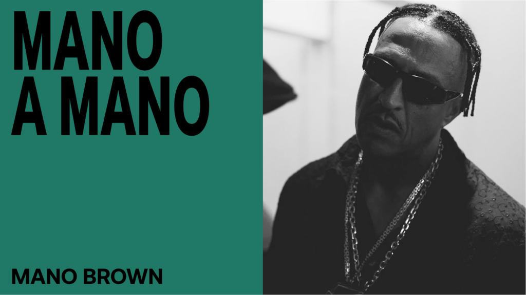
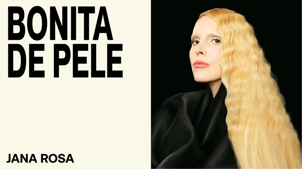
Zamunda is an audiovisual studio in São Paulo that produces sound-led content and contemporary narratives. We developed an identity that moves through São Paulo’s urban landscape, vernacular design, high contrast, a vibrant palette, and the electricity of the city streets.


An engineer, urban planner, feminist, and key figure in the making of MAM Rio, Carmen Portinho made the act of designing an instrument of social transformation. The exhibition tells her story and brings together works that reveal the breadth of her thinking.
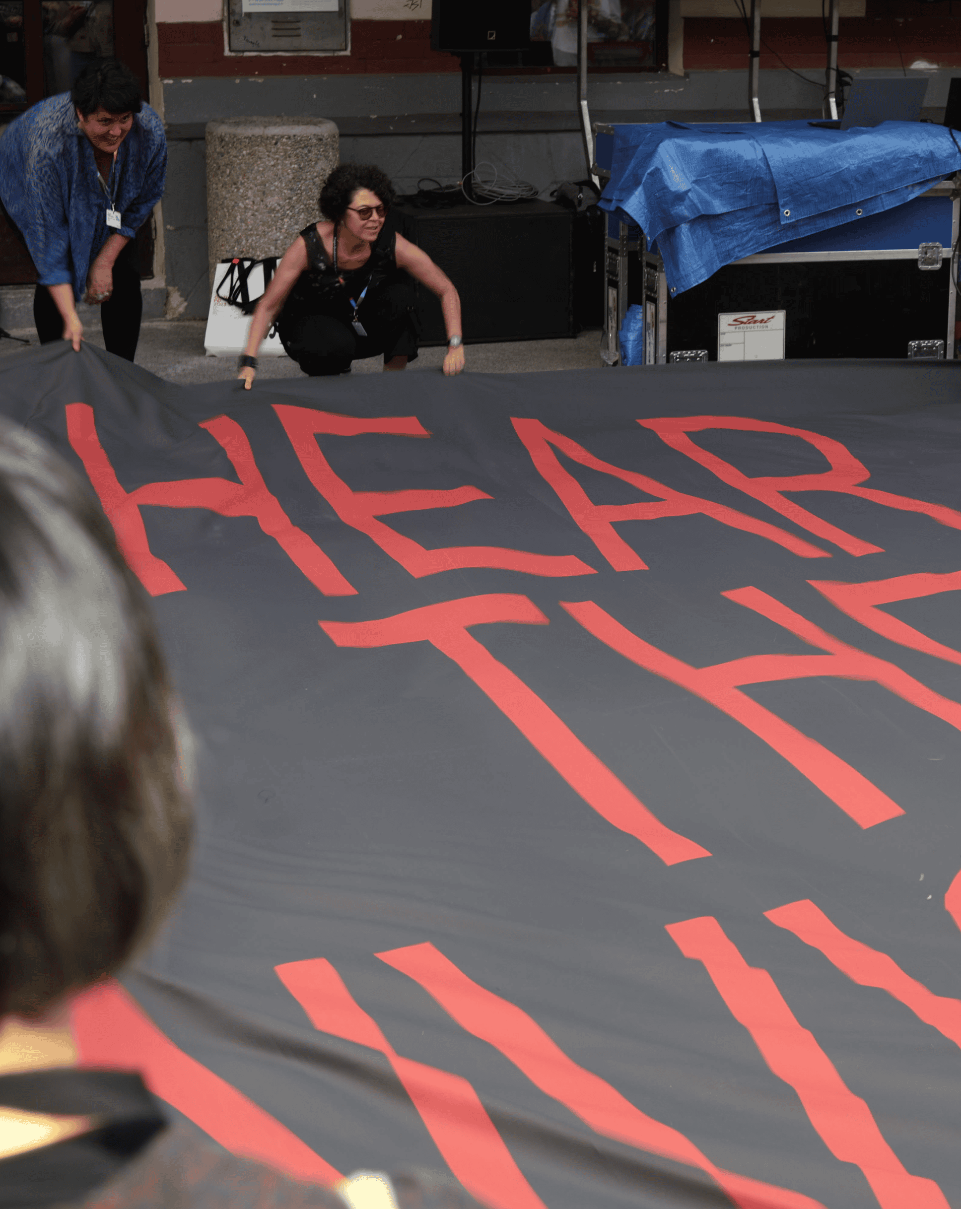
Encruzilhadas: We Believe in Street Corners brought together seven sound offerings by 29 Brazilian artists. To visually translate the exhibition’s concept, we created a symbolic universe of images directly or indirectly connected to the orixá, bringing this entire crossroads together in a single place: the now.