Zamunda
Branding, Identity
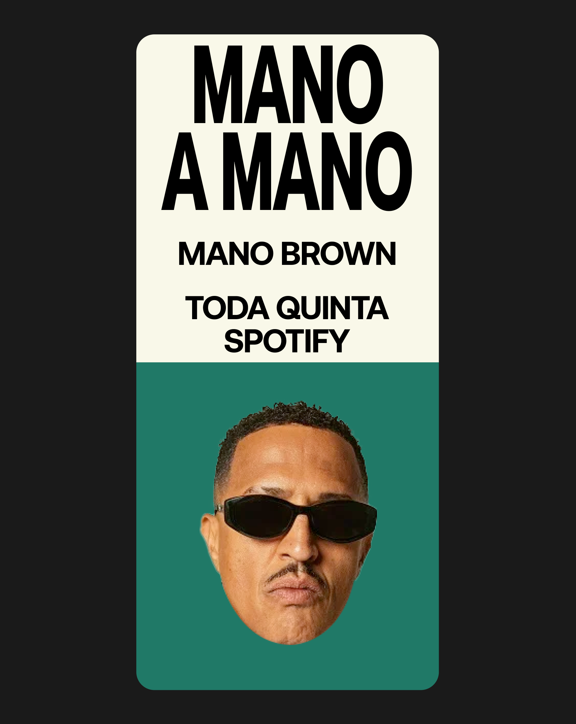
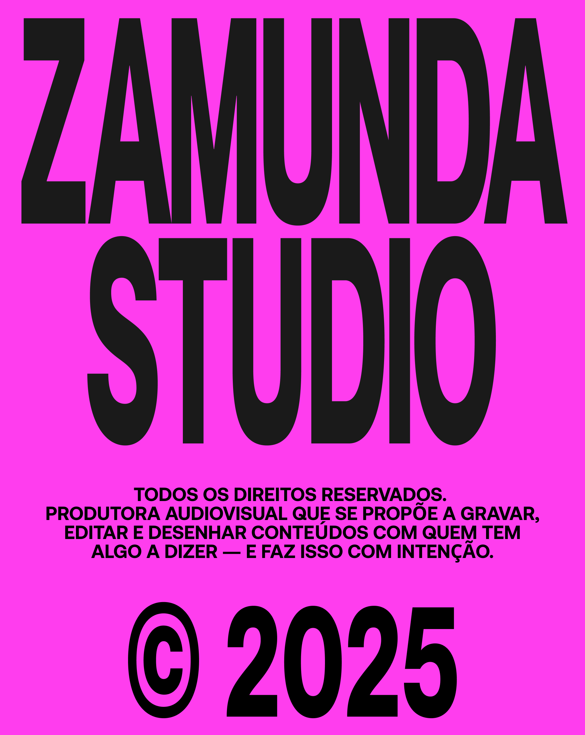
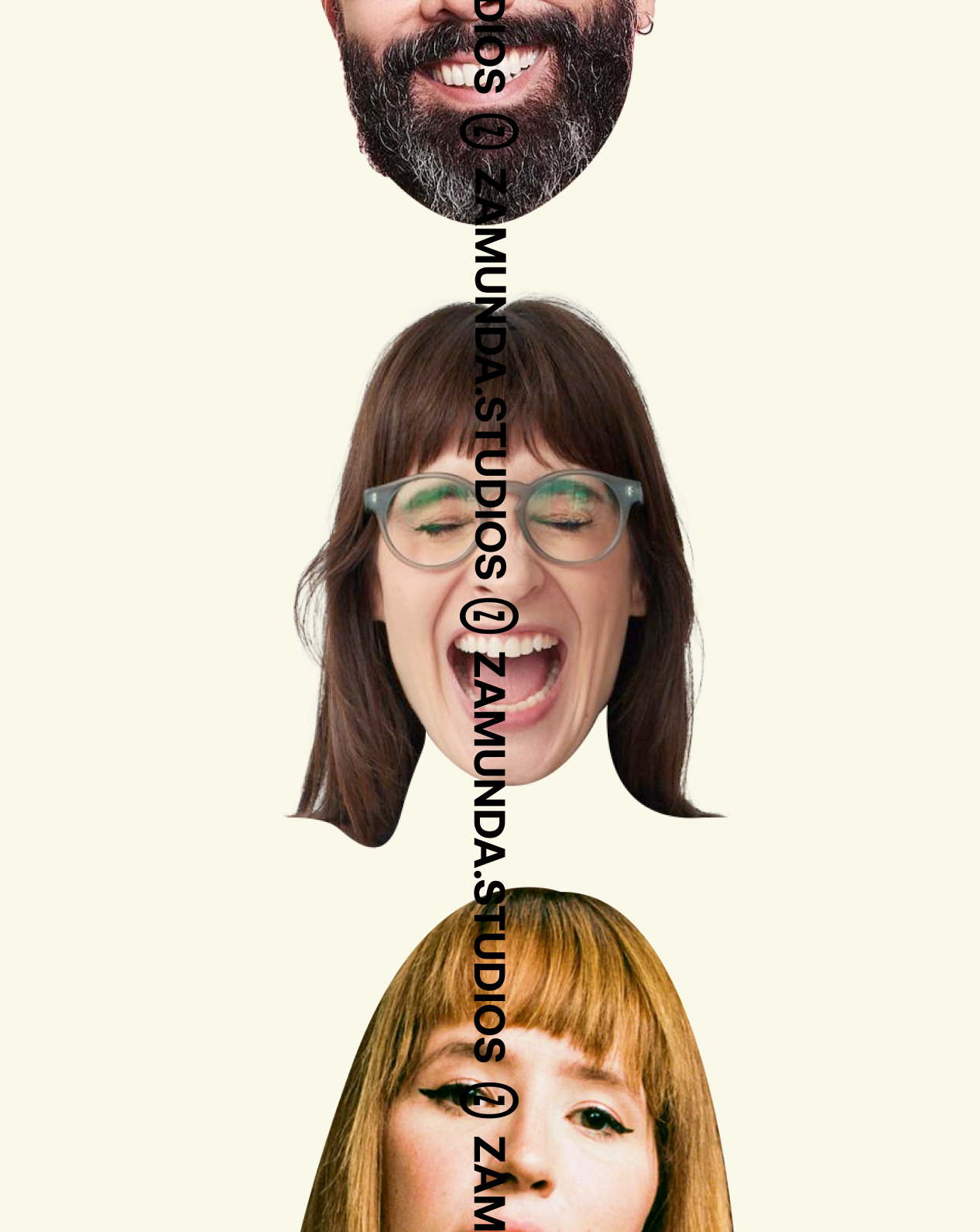
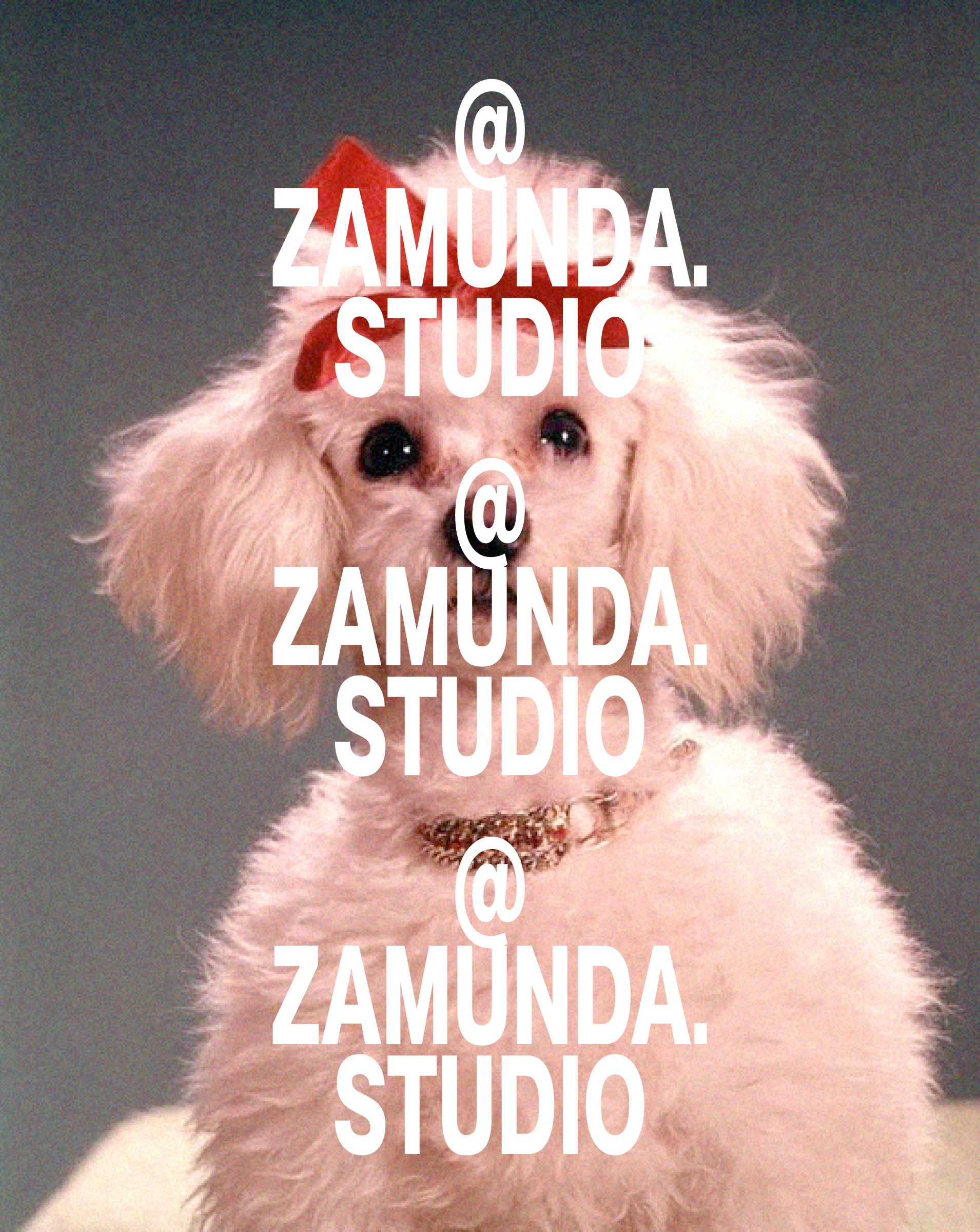
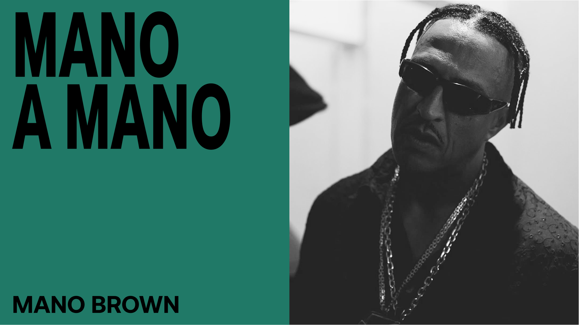
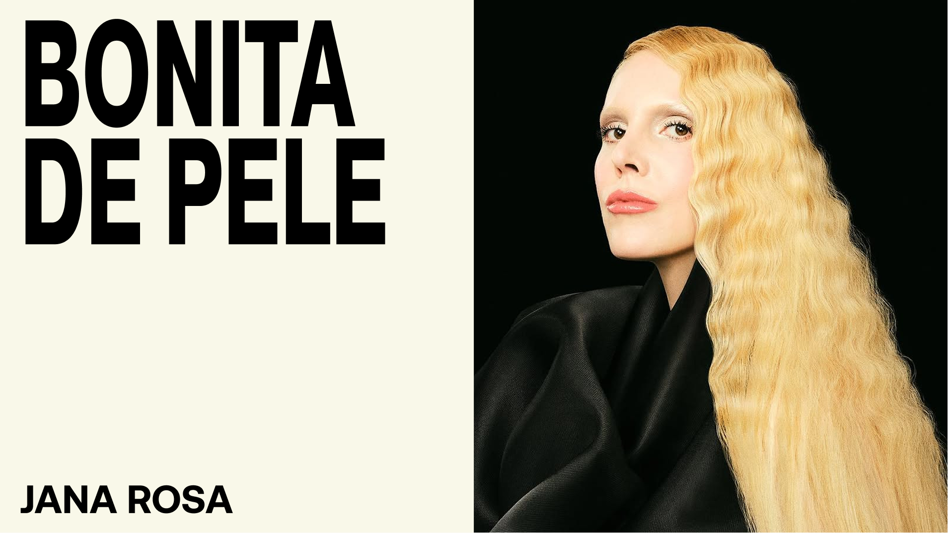
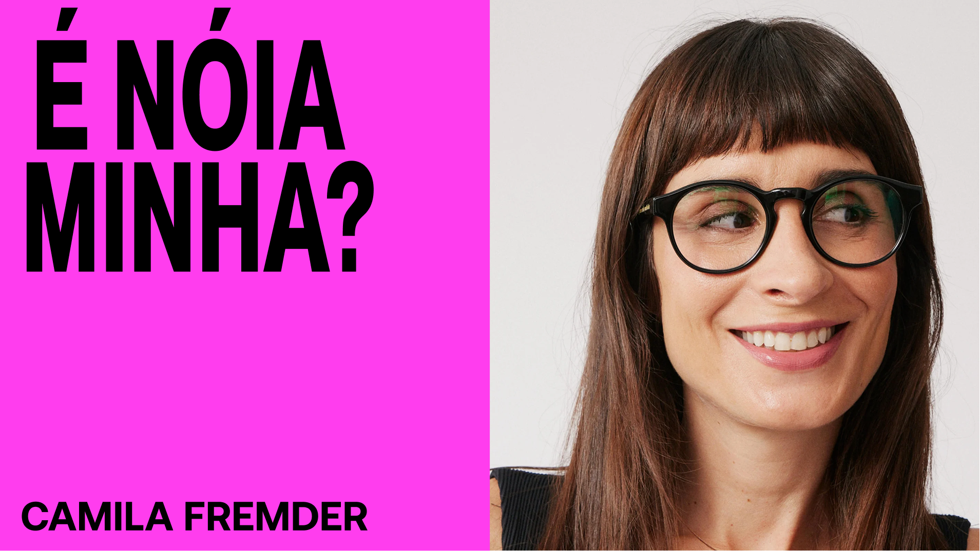
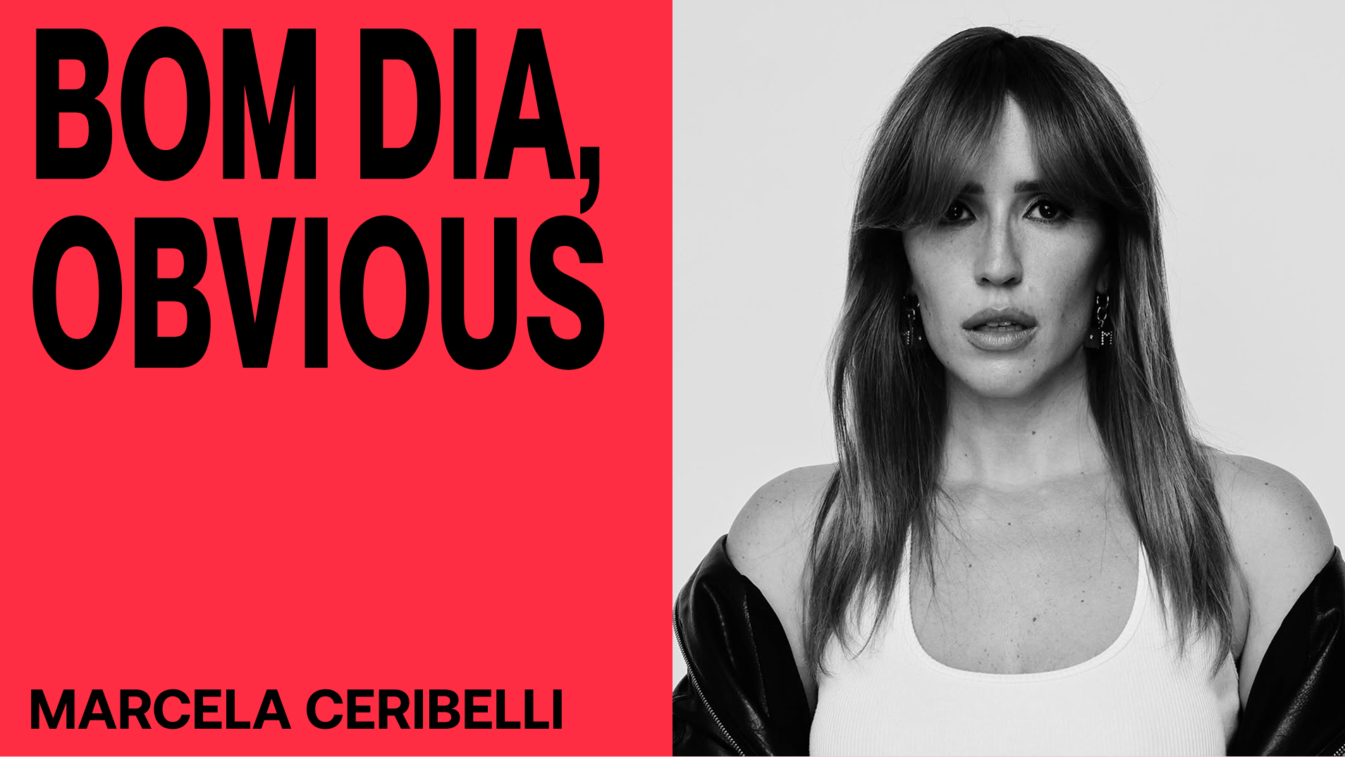
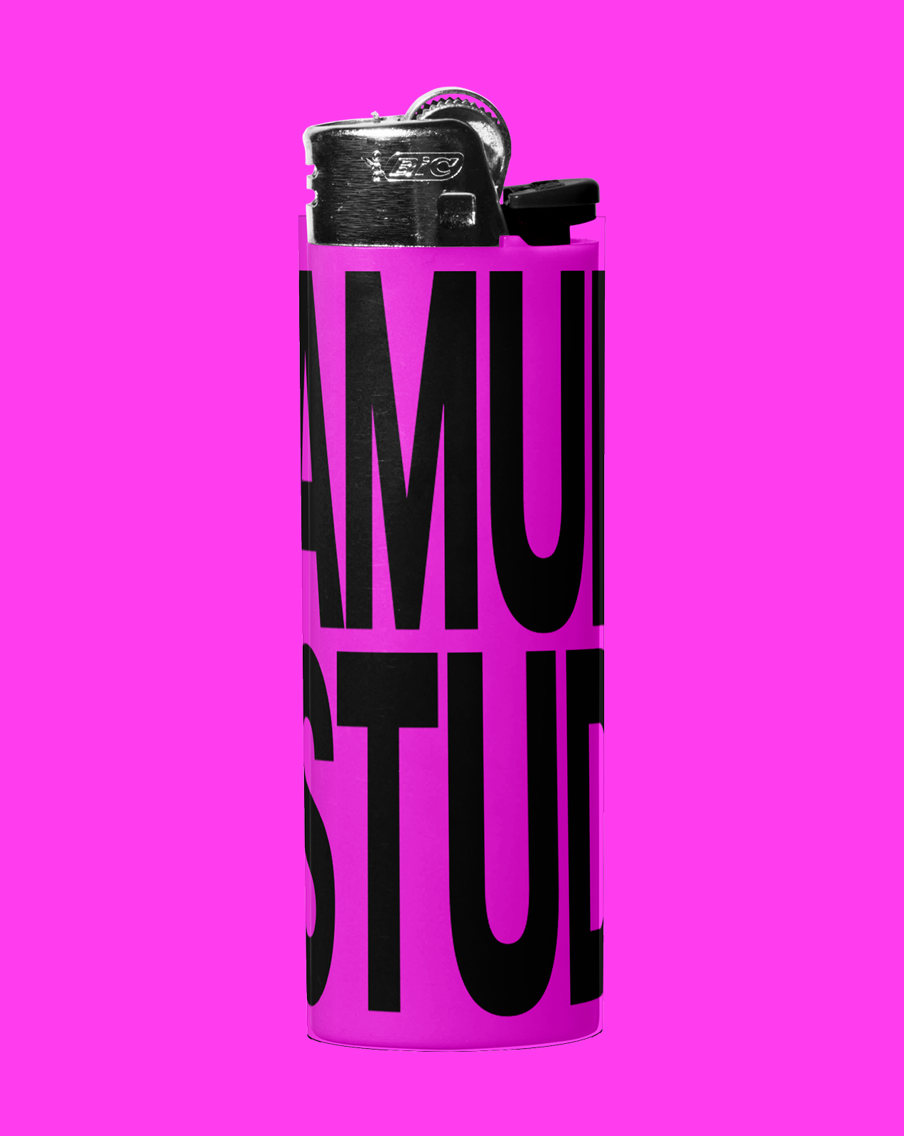
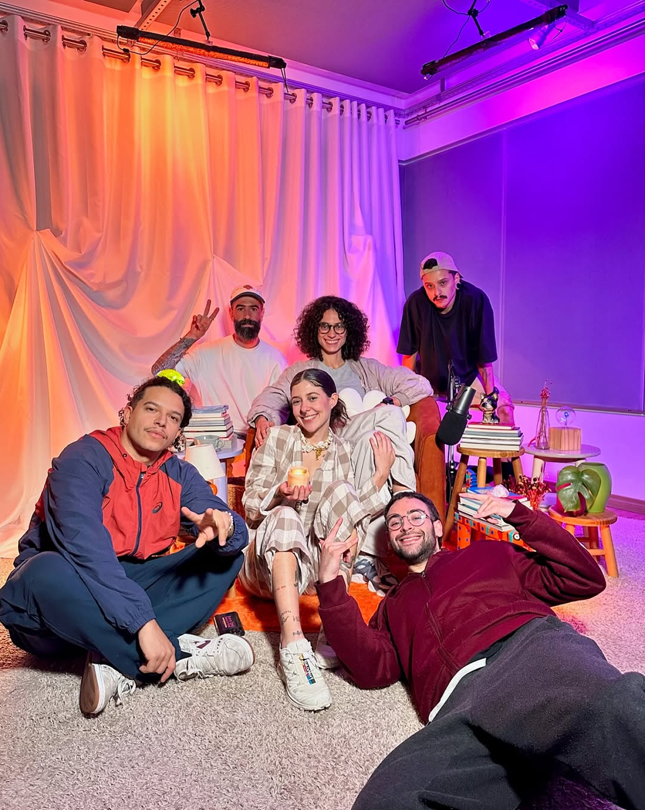
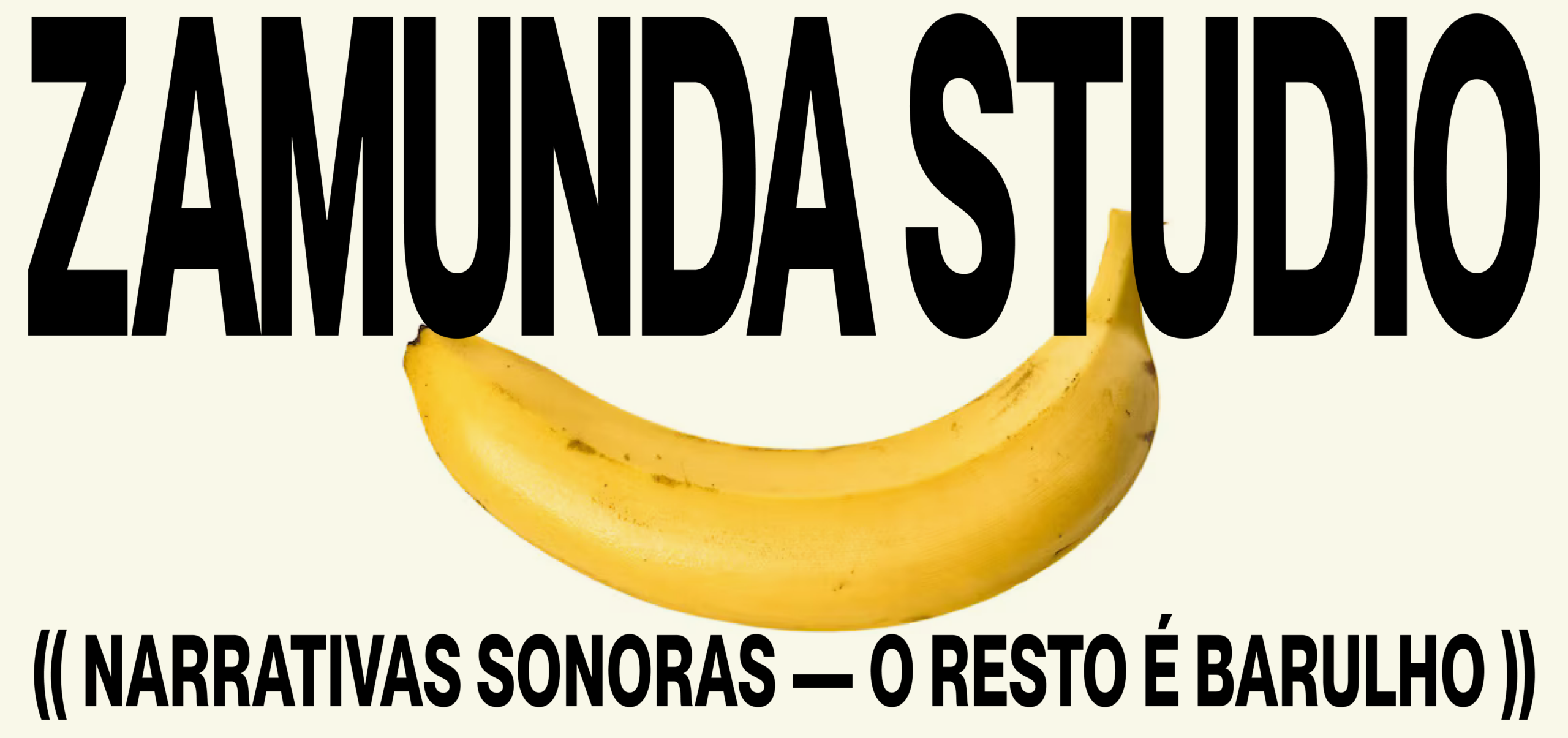
Zamunda is an audiovisual studio in São Paulo dedicated to sound-led content and narratives invented with people who have something to say. Its language emerges from the noise of São Paulo: the typography found on its streets, hand-painted signs, intense contrasts, sonic chaos, and the graphic energy running through the urban landscape. The system combines typography with a vibrant presence, high-contrast compositions, and an electric palette. This vernacular memory meets a direct, contemporary expression capable of accompanying different voices, guests, formats, and platforms while remaining instantly recognizable.


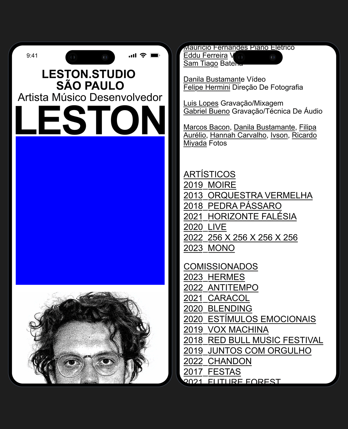
Leston investigates the relationships between sound, image, code, and permanence. In dialogue with his research, we developed a visual identity and website that bring the system to the foreground. There is an interval in the gap between error, the blue screen, and code, and it is within this unstable space, between control and failure, that the project comes to life.
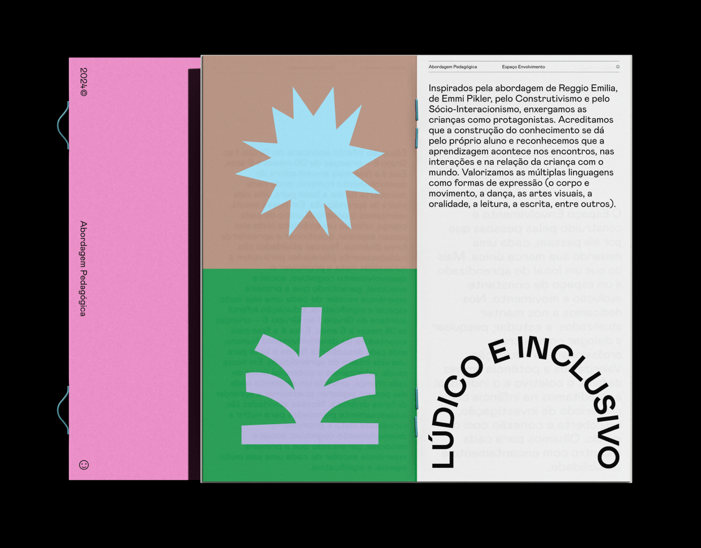
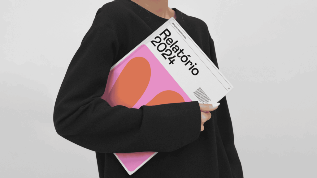
Childhood is not preparation for life; it is life itself unfolding. With this in mind, we worked with Espaço Envolvimento on a careful rebranding process, moving through conceptual and strategic stages and arriving at a visual expression that reflects the school’s new moment.
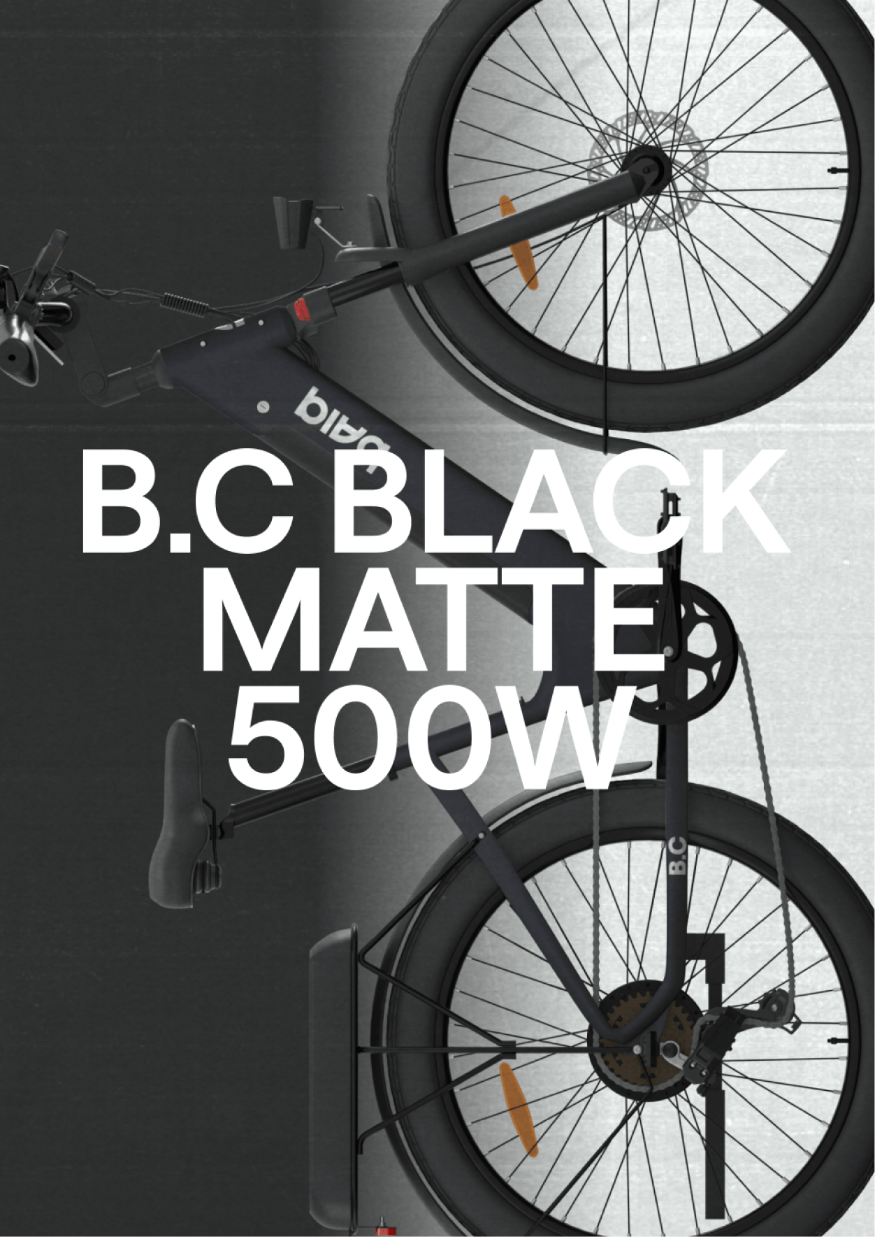
With electric bicycles and self-propelled vehicles, baiq turns getting around into a more fluid, intelligent, conscious, and free experience. We developed the naming, branding, visual identity, brand applications across the products, and initial communication support, all of which carry this idea of movement forward.
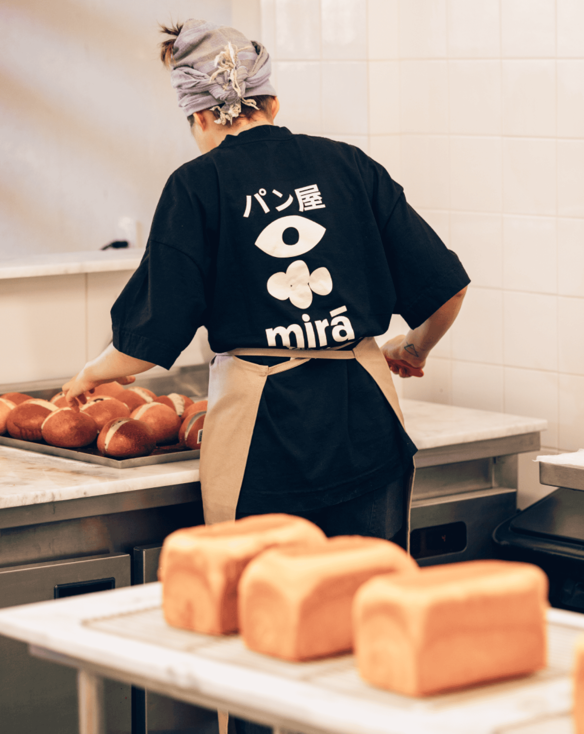
At Mirá, ancestral Japanese techniques, natural fermentation, and Brazilian ingredients turn bread into a territory of research and memory. It is an independent bakery built between tradition, discovery, time, and care.